
概要
Next.jsとStripeでECサイトを作ります。
今回の内容はフッターコンポーネントの作成、ヘッダーとフッターのlayout.tsxへの移行です。
背景
以下の記事の続きです。

やりかた
フッターの作成
_components配下にFooter.tsxを作ります。
- app/
- _components/
- Header.tsx
- Footer.tsx
- page.tsx
- layout.tsx
- _components/
中身は次のようにします。
import Box from '@mui/material/Box';
import Container from '@mui/material/Container';
import Grid from '@mui/material/Grid';
import Link from '@mui/material/Link';
import Typography from '@mui/material/Typography';
import Divider from '@mui/material/Divider';

const Footer = () => (
  <Box sx={{ flexGrow: 1 }}>
    <Container maxWidth="md">
      <Grid container direction="row" spacing={3}>
        <Grid item xs={12} md={4}>
          <Typography variant="h6">
            くうきやさん について
          </Typography>
          <Link href="#">
            会社概要
          </Link>
          </Grid>
        <Grid item xs={12} md={4}>
          <Typography variant="h6">
            ヘルプ
          </Typography>
           <Link href="#">
            お問い合わせ
          </Link>
        </Grid>
        <Grid item xs={12} md={4}>
          <Typography variant="h6">
            プライバシーポリシー
          </Typography>
          <Link href="#">
            利用規約
          </Link>
        </Grid>
      </Grid>
    </Container>
    <Divider />
    <Typography align="right">
      @ Kuki-ya, inc.
    </Typography>
  </Box>
);

export default Footer;
縦に3分割して「くうきやさん について」、「ヘルプ」、「プライバシーポリシー」を記載しています。それぞれリンクを用意していますが、今回は宛先までは作らないので適当です。
コンポーネントとしてのフッターが完成したので、ヘッダーと同様にトップページに差し込んでみましょう。
app直下のpage.tsxを編集します。
- app/
- _components/
- Header.tsx
- Footer.tsx
- page.tsx
- layout.tsx
- _components/
import Footer from "./_components/Footer";
import Headers from "./_components/Header";
const Home = () => {
return (
<main>
<Headers />
<h1>Hello world</h1>
<Footer />
</main>
);
}
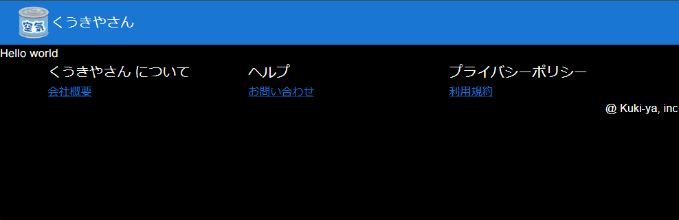
export default Home;npm run devして次のように表示されていれば成功です。
layout.tsx
前手順でヘッダーとフッターを直接page.tsxに埋め込みました。
ヘッターやフッターはサイト内で共通して表示されているべきなので、トップページ以外のページにも同様にヘッダーとフッターを埋め込まないといけません。
ヘッダーやフッターなどの共通して表示させるコンポーネントは、layout.tsxに書いておけば全てのページに適用させることができます。
app直下のlayout.tsxを編集します。
- app/
- _components/
- Header.tsx
- Footer.tsx
- page.tsx
- layout.tsx
- _components/
import type { Metadata } from "next";
import { Inter } from "next/font/google";
import "./globals.css";
import { AppRouterCacheProvider } from '@mui/material-nextjs/v13-appRouter';

import Header from "./_components/Header";
import Footer from "./_components/Footer";

const inter = Inter({ subsets: ["latin"] });

export const metadata: Metadata = {
  title: "Create Next App",
  description: "Generated by create next app",
};

const RootLayout = ({ children,}: Readonly<{children: React.ReactNode;}>) => {
  return (
    <html lang="en">
      <body className={inter.className}>
        <AppRouterCacheProvider>
          <Header />
          {children}
          <Footer />
        </AppRouterCacheProvider>
      </body>
    </html>
  );
}

export default RootLayout;
{children}にあたる部分がpage.tsxの中身が展開されるので、そこを囲うようにHeaderとFooterを差し込みます。
ヘッダーとフッターはlayout.tsxで表示するようになったので、page.tsxからは消します。
const Home = () => {
  return (
    <main>
      <h1>Hello world</h1>
    </main>
  );
}

export default Home;
npm run devして、layout.tsxの編集前と同様にヘッダー、フッターが表示されていれば成功です。
おまけ
参考
layout.tsxの説明
https://nextjs.org/docs/app/api-reference/file-conventions/layout
Material UIコンポーネントの紹介
Boxコンポーネント
コンポーネントをグループ化するコンポーネントです。
<div>タグと同じようなもんだよ、と書かれていました。
Containerコンポーネント
水平方向に中央寄せするコンポーネントです。
Gridコンポーネント
グリッド(格子)レイアウトを提供するコンポーネントです。
directionでrowを指定すると縦割りに、columnを指定すると横割りにできます。
<Grid container>で箱を作って、中身は<Grid item>で入れます。
Typographyコンポーネント
文字です。サイズをいい感じにできます。
このコンポーネントは自動で改行されます。
Typographyの下にあるLinkが、別の行として表示されるのはこの改行機能があるからです。
Linkコンポーネント
リンクです。
href=”#”はページの頭に飛ぶという意味です。
実際に公開するサイトでお問い合わせ先をこんなのにしていると怒られるので注意です。
Dividerコンポーネント
区切り線です。
コメント